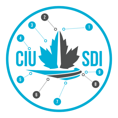
After months of design work, the Customs and Immigration Union (CIU) is proud to finally unveil its bold new logo and colours, which will serve to better reflect the organization we’ve become as we continue to grow and move forward.
A history of change
Our union’s image has undergone several changes over its long history, dating back to the days of the Customs and Excise Officers’ Association (CEOA), the union’s predecessor, formed in 1919. Throughout the years, this image has slowly evolved. The union’s colours and name changed in the mid-1960s when the Customs Excise Union Douanes Accise (CEUDA) was established as part of the Public Service Alliance of Canada (PSAC). In 2008, reflecting the changing nature of the union, CEUDA became CIU. Beyond the name change, the logo was modernized, becoming the classic CIU-SDI emblem used for the past decade and a half.
Evolving as a union
In recent years, we’ve received significant feedback from members who felt that aspects of our classic brand were becoming outdated. CIU’s leadership agreed that as the union continues to evolve, so should our image, to better represent both our organization and its members. And evolve our union certainly has:
- We’ve grown into a vibrant labour organization representing a diverse range of committed Border Services personnel who fulfill crucial law enforcement and non-law enforcement duties, from the frontline to much needed support divisions.
- We’ve won important labour victories — our past FB bargaining rounds, notably in 2021 and recently in 2024, have been nothing short of spectacular thanks to equally impressive mobilization, advancing our members’ working conditions like few others have.
- Through steadfast advocacy and lobbying, we’ve made our voice heard at the highest levels of political representation, shedding light on CBSA’s troubling practices, and pushing for much needed change, such as pension reform.
- Our national labour relations team continues to grow, allowing for more effective and efficient representation. With more Labour Relations Officers than ever before, we’ve been able to win more cases and better support our members as they push back against managerial overreach and abuse.
- Our national communication staff has also been expanded, increasing our capacity to cultivate crucial links with key allies and actors, and strengthening our ability to fight for and listen to our members.
- Across the country, Branch leadership and local representatives are more active and more dedicated than ever.
- Looking to the future, we have exciting new projects planned (amongst others, a new website and union store are currently in the works!).
Brand refresh: Same name, new image
It is with this evolution and with members’ feedback in mind that the National Board of Directors (NBoD), on the recommendation of its Standing Membership Engagement Committee, voted in September 2022 to entrust the CIU National Executive to oversee the ‘brand refresh’ of the union. The Committee — and the Board — felt that the union would strongly benefit from such a refresh to better represent its members and the duties they perform, and to address equity considerations.
Now, in August 2024, we are proud to present the new image of our union.
The name remains the same — ‘Customs and Immigration Union’— but our logo and colours have once again evolved.

As mandated by the NBoD, this modern logo and colour scheme update our image to address issues of representation and relevance. Emphasis is put on the different border streams while maintaining the link to our membership’s crucial role as Canada’s first line of defence.
Designed by CIU’s unionized staff, it is 100% union made.
Logo elements

1: Light blue and dark grey on a white background emphasize our members’ role in a novel and more progressive way, moving away from the more traditional red, white and blue colouring. This new symbol seeks to address equity concerns. The lighter blue is also a nod to our old uniforms, creating a strong link between old and new, past and present.
2: The middle break emphasizes the idea of the border, with the imagery representing both a doorway to the country and the border obelisks present along the Canada-U.S. border. It further symbolizes what happens within our borders, such as inland enforcement and non-uniform operations.
3: The split, uniquely stylized maple leaf maintains a link to our members’ duty towards the country and our previous logo, while creating distance from the employer and the federal government.
4: The typeface is modern and clean. It stands strong and upright. It is bold without being overbearing. It is compact, representing our solidarity with each other.
5: The top light blue line represents air mode.
6: The middle dark grey line represents land and rail modes.
7: The bottom light blue line represents maritime mode.
8: The three lines combined together emphasize movement toward the country and its borders and conveys the idea of a road to a port of entry.
9: The round, outward curve is shaped like a stylized globe, representing the world outside of our borders.
Condensed version
A condensed version of the logo has also been created to facilitate the logo’s use in places where the full version is not necessary.

Brand guidelines
The logo (full and condensed) can be used in full colour in the following colour combinations only:

The logo can also be used in full white, full ‘CIU blue’, full ‘CIU charcoal’, or full black, as needed.
For single-colour versions, white on a blue background is to be favoured.

All other colour combinations are to be avoided.
All graphical elements of the logo must always be included. The typographical elements can be omitted depending on use.
Colours
We refer to the new official CIU colours as ‘CIU Blue’ and ‘CIU Charcoal’.
CIU Blue
- Pantone 2201 C
- hex #00aed6
- RGB 0,174, 214
- CMYK 100 19 0 16
CIU Charcoal
- Pantone P 172-15 C
- hex #4d4d4d
- RGB 77, 77, 77
- CMYK 63, 56, 50, 44
Typography
The new typeface is Bebas Neue, in bold. The alternate typeface (not used in the logo) is Avenir Next LT.
Implementation
This initial announcement serves as the official launch of our new logo, which will now be in use on all our major platforms — website, social media, etc. Over the next few months, we will continue to update other existing material with the new logo. While this transition takes place, you may still spot the old logo here and there. That’s normal — the union has a lot of printed and digital material that will need to be updated!
Usage requirements
While use of the CIU logo is encouraged for typical purposes (on union-run pages, union billboards, union material, mobilization, etc.) CIU Branches that wish to use the logo as part of more novel projects (swag, etc.) should consult with the National Office to ensure the logo usage respects brand guidelines. Similarly, members should reach out to their Branch Presidents prior to using the logo for anything that deviates from typical use.


